Many users stop using a product not because it doesn't add value or can't solve their problems. They stop because getting onboarded to the product was simply too difficult.
80% of users report they have deleted an app because they didn't know how to use it. This user experience statistic is certainly relatable. Users DO delete an app, exit a website, or lose interest in a product unless they are instantly guided on how to use it.
To save your product from suffering the same fate, employ stellar user onboarding. This process ensures users are comfortable with the product from the get-go.
But watch out: onboarding can hinder the user experience if not set up correctly. Specifically, you should try to avoid these six common user onboarding mistakes:
Failure to recognize that onboarding is an ongoing process
Creating an overly lengthy process
Relying solely on product tours
Having a one-size-fits-all user onboarding process
Not providing user support during the onboarding process
Not using a third-party user onboarding platform
What are the goals of user onboarding?
User onboarding is a user's initial experience with your product, brand, and team. It runs from the moment someone signs up until they realize how the product will benefit their life, also known as their aha moment.
The primary goal of user onboarding is to guide users to reach this pivotal moment, discovering the product's core value and benefiting from it frequently.
User onboarding is crucial for nearly any product, but it's especially key for product-led companies who implement a freemium or free trial revenue model. The faster users find and comprehend a product's value, the more likely they will become brand advocates and profitable customers.
What's considered bad practice in user onboarding?
Any practice that prevents users from quickly learning how to use your product to solve their problems is considered bad practice.
As previously mentioned, the crucial goal in onboarding is to assist users in finding value in your product. Throughout this process, you must make it easy for them to do so. Setting users up for success with little to no friction is paramount.
Some good practices in user onboarding are:
Producing educational content that explains how to use the product
Providing product tours and reliable customer support
Collecting feedback
…and many other elements that make users' lives easier. Without further ado, let's cover some onboarding mistakes you need to avoid.
6 onboarding mistakes you need to avoid
Failure to recognize that onboarding is an ongoing process
The user onboarding process begins way before users try a product; it starts with the interaction users have with your business. To make an excellent first impression, you should create content that clearly displays how users can benefit from the product and enthusiastically showcase the product and explain to users what they can expect.
And just like user onboarding begins before users try the product, it also doesn't end after they complete the process. User onboarding is not a "one and done" thing; it's an ongoing process that extends beyond activation and into the customer journey. It's essential to continually identify users' needs and expectations, provide solutions, and guide users toward success.
Here are two ideas to encourage an ongoing onboarding process:
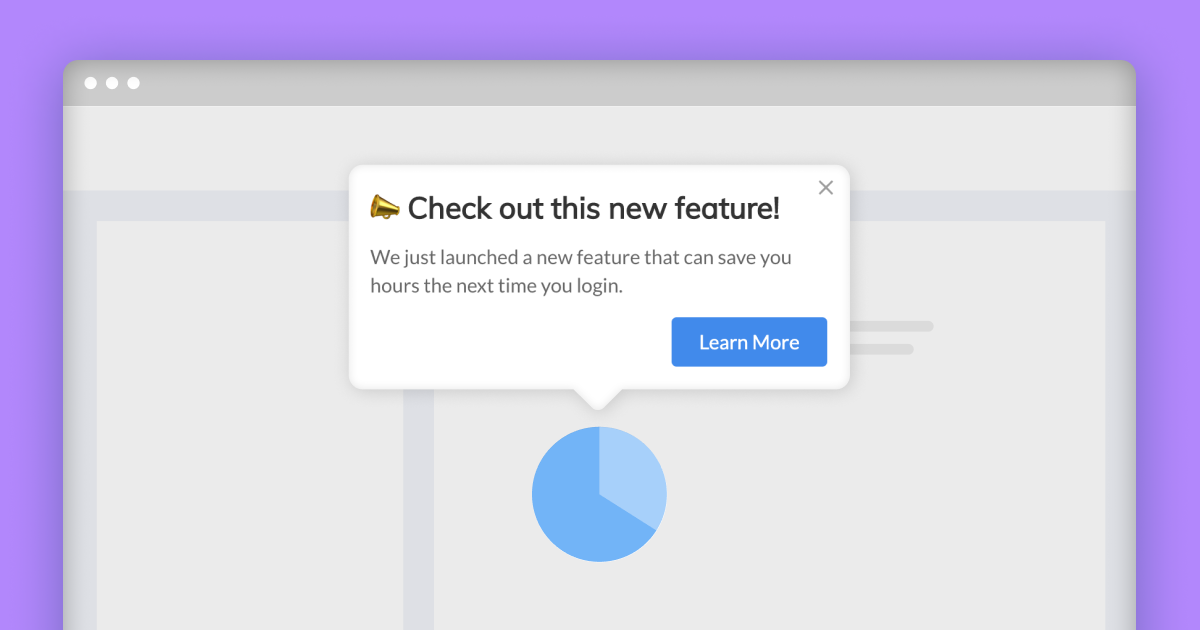
Introduce gradual feature discovery: In primary onboarding (AKA minimum viable onboarding), you'll show users the product's core features and initial value propositions. As users interact more with the product, introduce secondary features when they are ready, for example, through tooltips or hotspots to elicit attention and engagement.
Ensure users adopt new features: Once users are gradually guided toward new features, implement interactive walkthroughs to show them how to use them. If executed properly, they are an excellent way to ensure users discover, adopt, and derive value from a feature.
Creating an overly lengthy process
A huge challenge in onboarding is providing necessary information to get new users up to speed; without overwhelming or boring them.
A major goal of onboarding is to minimize users' time-to-value. However, it's easy to get carried away and bombard the user with info about all the amazing things your product can do.
Keeping the onboarding process brief should always be top of mind for product teams, but note that onboarding times will vary across niches. For example, a banking app will ask for more user inputs, so there will be a longer onboarding process. Contrast this to a gaming app, which may be able to successfully onboard users with a splash screen.
rather than aiming for a precise time, it's wiser to evaluate every step of the onboarding process and explore if it's truly necessary and value-adding. To do this, you can implement a third-party onboarding and analytics platform that will tell you how many users drop off at each stage of your onboarding (also called a drop-off report.)
As you look at the drop-off report data, you'll consider which onboarding steps to keep or remove. Ask yourself: "Will this step benefit the user?" and, "Can this step be done later?"
Relying solely on product tours
Yes, product tours are important facets of a seamless user onboarding experience. They are powerful tools for guiding users to uncover value in your product and eventually benefit from it.
But the mistake that some SaaS products often make is that they implement a product tour to onboard users—and just stop there.
Product tours on their own are not enough. Focus on giving users a fantastic product tour to introduce them to the product and help them understand how to use features efficiently, don’t stop providing other sources of onboarding content, like checklists, reminders, explainer videos, and blogs.
Here is a product tour created with Lou:
And when you are implementing a product tour, always give users the option to skip. The last thing you want to do is waste their time.
Having a one-size-fits-all user onboarding process
A professional retoucher won't want to sit through an intro video for Photoshop, just like a salesperson won't be interested in watching a tutorial video of a feature created for an HR assistant.
The same onboarding experience won't be practical for all end-users. Their needs, skills, knowledge, motivation, and abilities vary, and mismatching their onboarding experience can be hugely detrimental. It can dampen users' progress, and the loss of momentum can quickly trigger product abandonment.
To avoid this scenario, personalize customer onboarding based on the available customer data, making the experience much more engaging.
Here are a few ways to do it:
Set up the onboarding process using previously collected data: If you've already collected basic user information (name, country, role, company) use that data to tailor the initial customer experience. This strategy will make it easier for them to relate to the product.
Personalize the process based on user needs: Users sign up for a product for various reasons, so not all users want to use the same features. Tailor the onboarding experience based on what users are trying to achieve with the product, making it easier for them to reach their "aha moment."
Personalize the process based on the user's level of expertise: To inspire user confidence, respect the user's level of expertise. Otherwise, they will begin doubting the product's capabilities or even their own.
Not providing user support during the onboarding process
Some products make the mistake of leaving users hanging after onboarding. But not every user will understand the product immediately, so continue to support users throughout their customer journey. Its especially important to keep guiding users if your product is complex, as it’s nearly impossible to cover all features in a short time
One technique is tooltips appearing when users first interact with a feature or reach a specific screen. It's a great option because assistance only appears when the user needs it, so it doesn't overwhelm them with information overload.

Another innovative method is to implement in-app guidance throughout the product. This support is contextual so users should find it relevant and immediately helpful.
Finally, provide educational resources like a knowledge base, help articles, links to articles, blog posts, or tips within the product. This strategy is especially essential for products associated with complex topics like health and finance.
For SaaS products, the minimum CRR is 35%. But if you continue to support users from day one and every day after, you'll have a much higher chance of keeping them.
Not using a third-party user onboarding platform
Lastly, third-party onboarding platforms help avoid wasting valuable time, energy, and development resources, one of the most common mistakes. User onboarding tools and platforms will help create more seamless onboarding flows in a short timeframe, segment users efficiently, analyze product data, and eventually offer a superior onboarding experience.
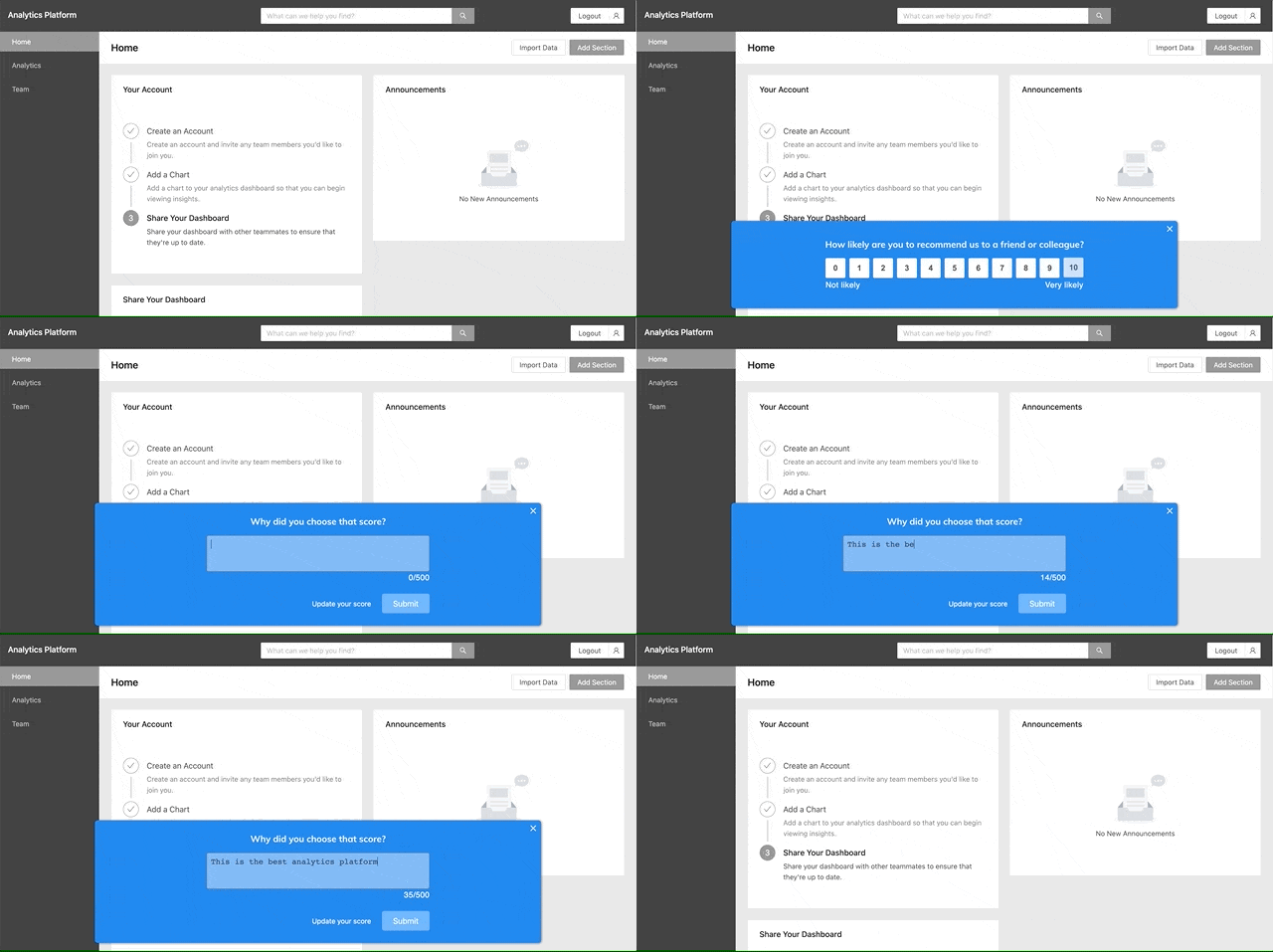
You can assist in user onboarding with many compelling features, including onboarding checklists, tooltips, NPS surveys, segmentation/targeting, tutorials, analytics, and more.

Lou is a no-code onboarding platform that doesn't require technical knowledge or dev resources, so it's perfect for teams that value a speedy implementation and ease of management.
Conclusion: Onboarding is a delicate balancing act
Onboarding isn't easy. It requires more than just product tours or simple sign-ups; it's an involved process where you balance showcasing a product's value and asking for too much of a user's time.
Hopefully, this post displays how many obstacles can impede a customer's progress while indicating some of the best ways to deal with them.
Ready to start creating seamless user experiences? Start for free with Lou and see your onboarding process transform.
Published on September 15th, 2022
SHARE THIS POST


