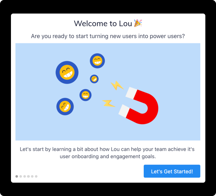
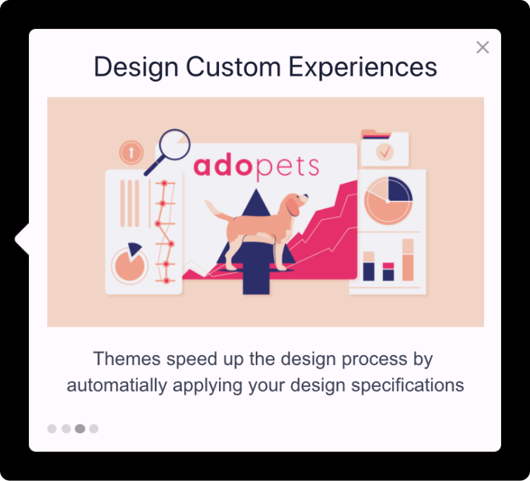
Product tours handle the essential job of introducing and familiarizing users with your product or new features. When executed well, they improve UX and encourage users to take meaningful actions. Great product tours also decrease new users’ time to value, enhancing conversion, activation, and retention rates.
However, when they first hit the market, product tours got a bad name. V1 product tours weren’t interactive or efficient. Long tours bombarded users right when they logged onto the platform, forcing them to click through every little thing the platform could do. Overall, product tours were overwhelming and not immediately helpful, with no clear goal in mind. Chances are you’ve taken a bad product tour, but we can guarantee it wasn’t a Lou product tour.
In fact, the contrast between good product tours and bad product tours was so stark that some companies started labeling good, interactive product tours as “guided tours” or “product walkthroughs.” They claim they are better than typical product tours because they interactively teach and help users reach milestones and key activities. Here at Lou, we think that’s exactly what a great product tour should do. So we keep it simple and just call product tours, product tours.
Let’s dive into what makes a great product tour and why they’re a powerful tool for increasing product adoption.
What Makes a Product Tour Powerful?
Great product tours are powerful because they can:
Drive product adoption and the adoption of new features
Make onboarding self-serve and decrease support tickets
Catch users in-product at just the right moment to increase engagement
Gamify the onboarding process & lower the learning curve for adopting a new platform
Give insights into user behavior so you can analyze, iterate, & improve their experience
In fact, in 2021, 85% of users who experienced a Lou product tour reported that it was helpful!
5 Qualities of a Great Product Tour
Distinct features and varying user needs may make effective product tours look different from platform to platform. However, there are universal best practices for designing a great product tour that helps users adopt products with ease.
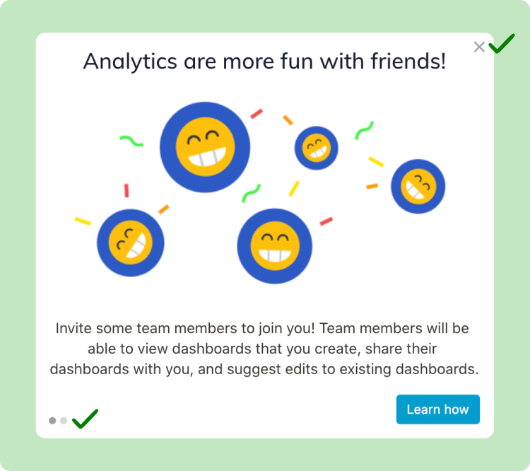
They’re designed with a goal in mind
They’re timely and relevant to the user’s journey
They’re well-designed (to-the-point and look built-in house)
They let users opt-out
They’re tested and iterated on
5 Qualities of a Bad Product Tour
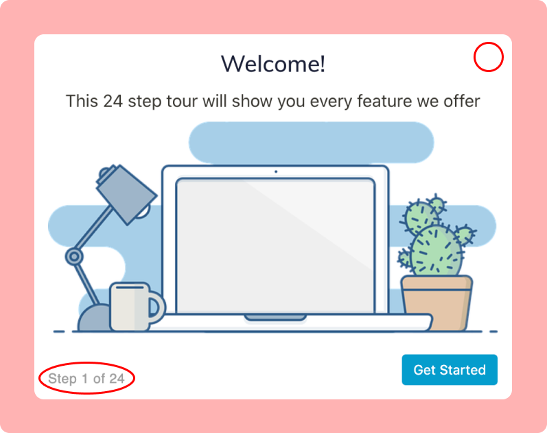
Bad product tours do not consider the user’s journey or goals. They ultimately give users more obstacles to overcome instead of actionable assistance.
They don’t have a clear goal and aren’t driving users towards an action or milestone
They require too many steps or include too many blocks of text
The information contained isn’t relevant to where the user is at in their journey
They hold users hostage and force them to take the whole tour
They’re published but never iterated or tested on again
What Makes a Great Product Tour?
Let’s dive deeper into what specific elements make a product tour great.
They have a clear goal
The best product tours focus on goals, not features. They include concise but in-depth directions on how to help users solve a problem. Without a clear goal, you risk squandering your user’s motivation and attention, which may be difficult to regain.
Goals might look like reaching “aha” moments, or when a user has an emotional reaction and suddenly grasps the value of your product. Goals could also look like significant milestones in a user’s journey, like getting them from signup to onboarded, or even to an upsell. Similarly, goals could be achieved on a smaller scale, like getting users to adopt a new feature or visit a particular web page.
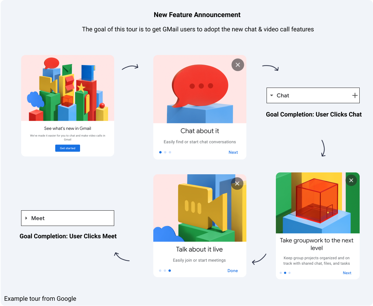
In this example from GMail, they launched a tour that announced two new features, the ability to "chat and make video calls in GMail". As you can see in their 4 step tour, GMail announces the new features and then guides the user through navigating to the new chat and meet options in the GMail nav bar.
By setting a goal, product tours will drive results for the milestones and metrics you care most about. Additionally, goal-setting is a fast and effective way to see if your product tour generates the results you want.
With Lou, designating a goal for your product tour is as simple as one click. Lou’s goal tracking feature captures how many users adopt a feature, click a button, or visit a page in your app. By creating a goal and linking it to a Lou tour, you receive access to advanced analytics that show exactly how effective the tour is at driving users toward its associated goal.
They reach users at the right time
Great product tours trigger tailored messaging to specific users and meet them at the right time in their journey, like when they’ve reached a particular page or completed a specific milestone, for example. Showing tours to the right users when they complete a milestone can encourage further engagement.
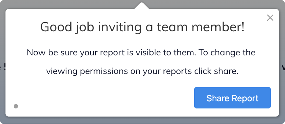
For onboarding tours, we recommend setting them to start immediately after a user creates their account. Sometimes, it’s helpful to trigger a product tour the second or third time a user logs in if they didn’t complete the tour the first time. Note that just because a user opts out once doesn’t necessarily mean they won’t be interested in taking the tour a little later.
Segmenting your audience will allow you to display the right tours, to the correct users, at the moment it's most helpful to them. Targeted tours help users reach their “aha moment” efficiently.
When purchasing a product-tour solution, make sure it offers the ability to easily create user segments so that you can launch targeted tours without involving your dev team.
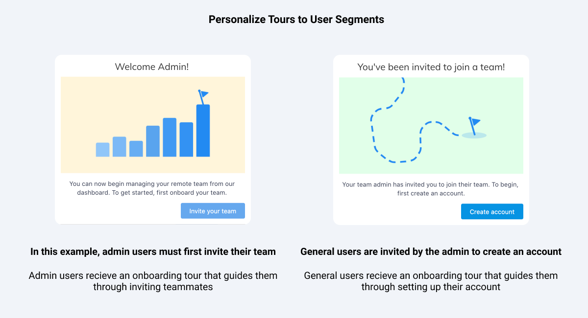
In the example below, you can see two different onboarding tours within the same platform. One onboarding tour is geared towards admin users whose first milestone is inviting their team, while the second onboarding tour is designed for general users whose first milestone is to create an account and join the team the admin invited them to. Targeting tours to different user segments ensures that the message is relevant and personalized to each user.
They are well-designed
Users are more likely to engage with your product tour if it’s well-designed and looks native to your product. It’s also imperative that you keep your tour short and to-the-point. Users are 3 times more likely to complete a tour if it has 5 steps or less. If you need a tour to cover a bulk of information, think about how you can break it up into multiple tours that are easier to digest.
Here are some more tips for a well-designed product tour:
Choose a color for the tour steps that stands out against your platform, and keep the font and corner radius of the tour steps consistent with your brand. Choose a text color and size that’s easy to read, too.
Add visuals. Images are valuable because they can make tours more engaging or allow users to see simplified examples. Occasionally, embedding instructional videos right into a tour step is helpful so that users can watch them without leaving the page they’re on.
Ensure you position each tour step close to where the user needs to click or read and that it’s not obscuring important information. If it is, be sure to change the positioning of the tour step.
Consider darkening your platform’s background during the tour. A dark environment is helpful to minimize distractions if there’s one place you want to draw your users' attention to. However, do not add an overlay on users' screens when you want to familiarize them with an entire page, like in an onboarding tour on a dashboard.
They let users opt-out
An excellent product tour doesn’t hold users hostage—rather, it allows them to opt-out through these 3 methods:
Tell users what the tour is about at the get-go and ask them if they’d like to take it. They can continue by clicking the button (call-to-action) that would allow them to start the tour.

Include an exit icon in each step of the tour so users can choose to leave at any time.

Lastly, you can also elect for product tours to close when a user clicks on the background of your platform. This can be a powerful option in the right setting, but we recommend being cautious when choosing this opt-out method, as an accidental mouse click could cause users to close a tour before they are ready.
They’re tested and iterated on
Don’t treat product tours as one-and-done solutions—test and iterate based on the analytics you receive. A/B testing unlocks the ability to compare the behavior and progress of users who received product tours to those who didn’t. You can also pair an A/B test with a code-free goal to obtain access to advanced analytics that can help you determine how effective your experience is at driving users towards a key activity.
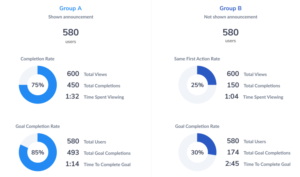
We recommend evaluating how long users are spending on each step of the product tour, where they’re dropping off, and which particular product tours are more helpful than others. Integrating your product tour software with your analytics provider will help you better understand the impact product tours have on your overall metrics. At Lou, we offer one-click integrations with no set-up time with most major analytics providers.
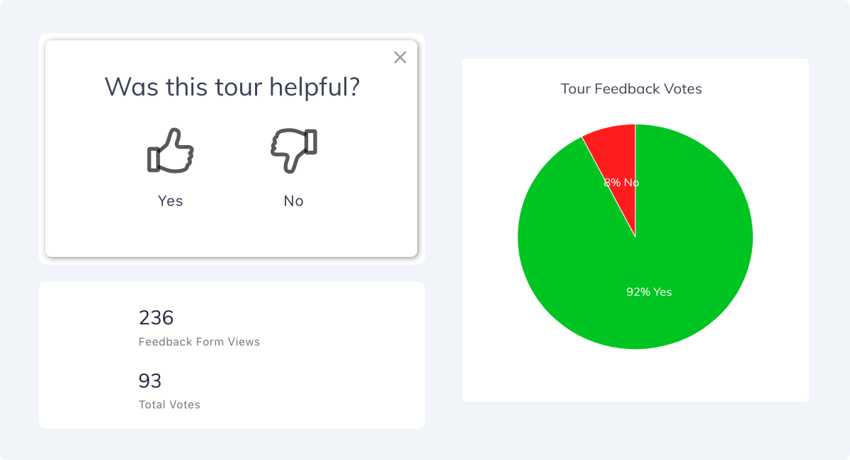
Lastly, we recommend surveying your users at the end of a product tour to gain quantitative data into their experience. However it’s important to be thoughtful about how often a user would be asked to take a survey so that you can be sure to maintain a frictionless user experience.
With all of these elements to consider, product tours can feel like a technical and challenging undertaking. But with Lou, you can create completely code-free product tours with very little time and effort. Our average user launches their first product tour in less than an hour!
Ready to create compelling product tours that guide, train, and delight your users? Create a free account now and start building your own tours.
Published on September 10th, 2021
SHARE THIS POST


